eChhawani — Government App Redesign
A civic services app that asked residents to remember property numbers and dig through fields just to see what they owed. I redesigned it around recognition instead of recall.
The problem
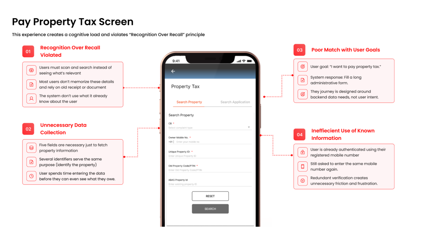
eChhawani brings multiple civic services — property tax, water billing, and more — into a single application. In practice, residents had to navigate through different services just to find the one they needed, and remember details like their property number before they could see anything useful.
Checking a pending due meant recalling where it lived in the app and filling in fields to prove it was theirs — before they'd even learned what they owed.

Who this is for
Based on the user interviews, two primary user groups emerged. The majority of eChhawani users are property owners aged 45 and above, who primarily use the app to view and pay their property-related dues. This age group represents the core user base, as they are the registered owners responsible for managing these payments.

A secondary user group consists of individuals aged 20 to 30, who typically use the app on behalf of their parents or other family members. While they may not be the property owners themselves, they play an important role in assisting with bill payments and other related tasks.
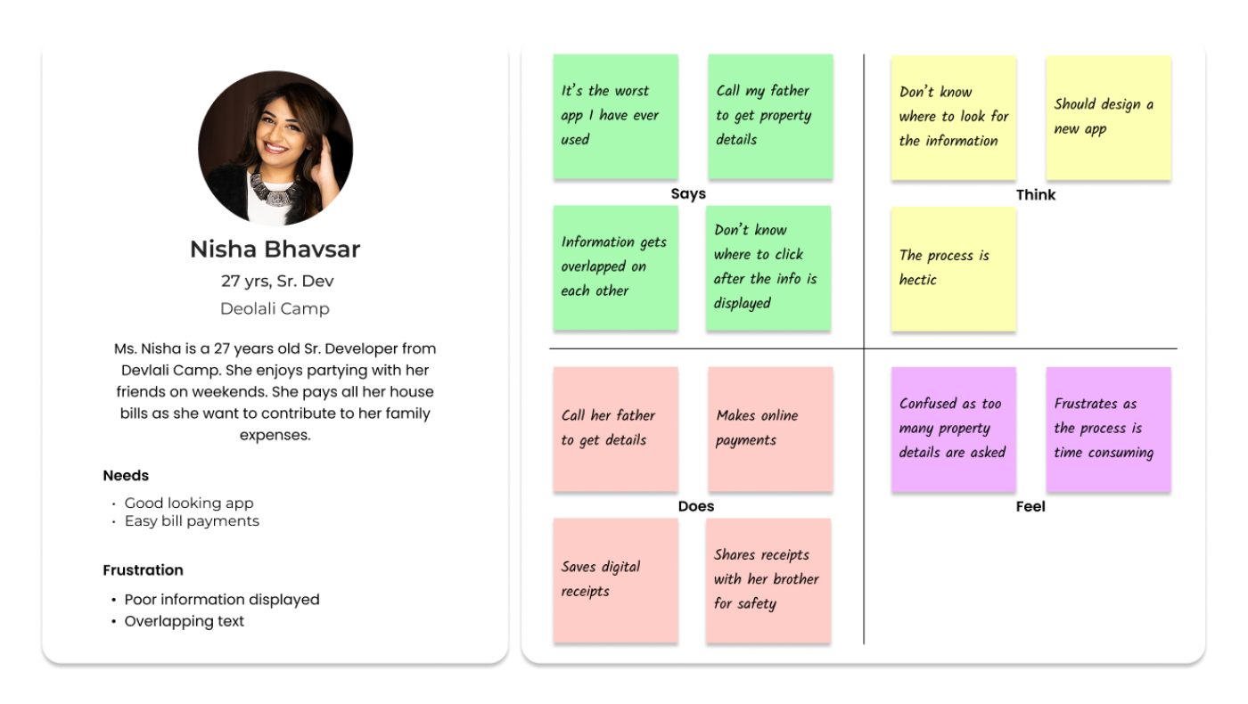
This segmentation helps ensure that the redesigned experience addresses the needs, expectations, and digital proficiency levels of both primary and secondary user groups.
Customer journey map
Mapping the full journey — login through aftermath — showed exactly where the earlier experience broke down, and where the redesign needed to surface information instead of asking for it.

User flow
The redesigned flow for the core task — paying property tax — collapses the old search-and-recall pattern into a straight line from login to payment success.

What research surfaced
Recall-heavy navigation
Users had to remember service locations, property details, and payment status all at once, just to complete a simple task.
Users need to know what matters now
Payment visibility shouldn't require searching — dues need to surface on their own, not wait to be found.
Context makes decisions easier
Presenting related information together, instead of scattering it across screens, made the app easier to trust.
"How might we help users recognize what needs their attention instead of making them remember where to find it?"
The solution — recognition over recall

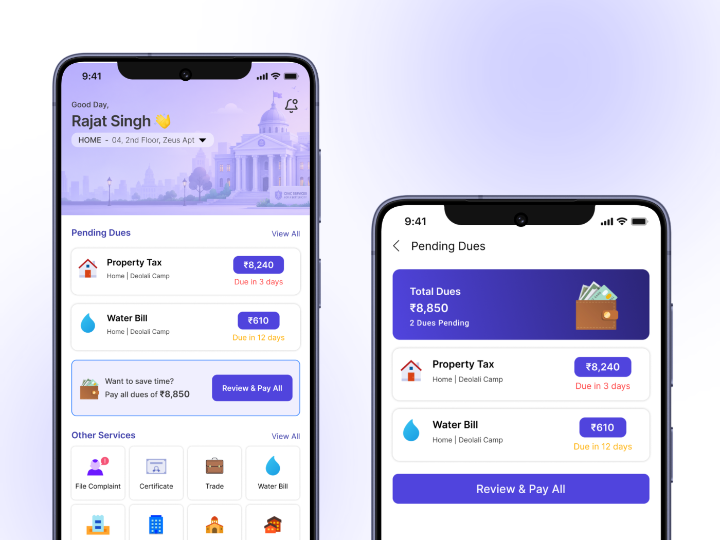
Surface pending dues
Payments now appear directly on the home screen with amount and due date — no need to hunt for them.
Make services recognizable
Clear visual cues and labels replace the need to remember where each civic service lives.
Reduce payment effort
A consolidated "Pay All" option settles every outstanding due in one action instead of many.
Outcome
The redesign removed recall-dependent interactions across the app, lowering the cognitive load required to complete everyday civic tasks. It holds up across digital-proficiency levels — from residents who've used the app for years to family members opening it for the first time on someone else's behalf.

Reflection
Recognition can reduce cognitive effort — the right options at the right time matter more than simply offering fewer options.
Information architecture shapes behavior. How something is organized determines how confidently people navigate it.
Research should influence the solution, not just decorate it — framing the problem around real behavior is what actually clarifies the fix.